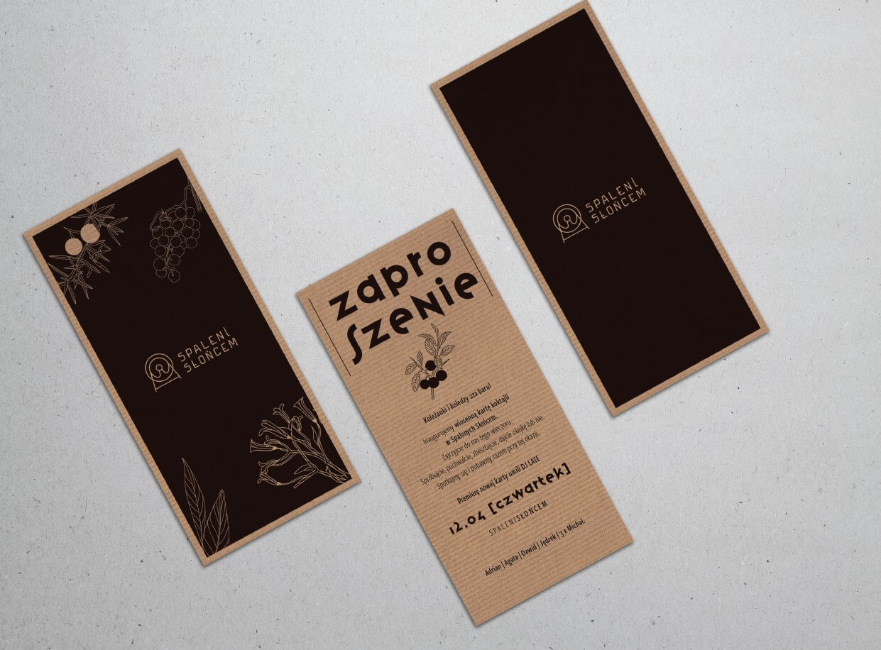
Spaleni Słońcem [Sunburnt] is a cocktail bar in Łódź, located in the Ramisch factory at OFF Piotrkowska. We had the pleasure of developing a creative work for their springtime menu. The idea was based on presenting the ingredients of individual drinks in the form of monochromatic illustrations.
Portfolio Category: VISUAL IDENTIFICATION
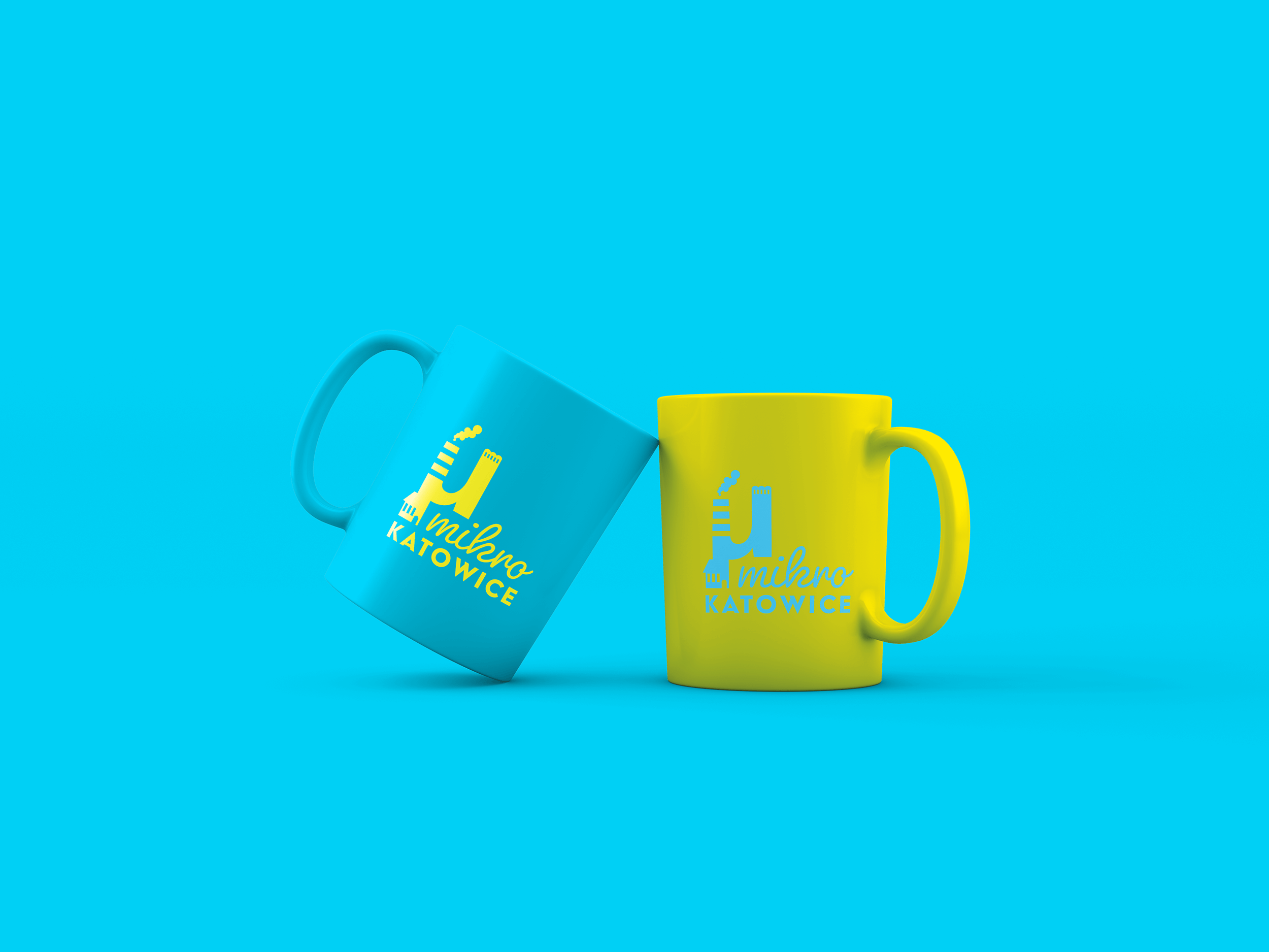
Once again, this time under the slogan of “MikroKatowice”, a social project implemented by Stowarzyszenie Górnośląski Klaster Kreatywny [Upper Silesian Creative Cluster Association] was launched. Katowice bets on a change from scratch. Year after year, we had a chance of developing identification for this project. You can see the solution below. We employed a micro symbol and combined it with an illustration depicting Silesian mines and a post-factory atmosphere. The colours make a reference to Związek Górnośląski [Upper Silesian Union].
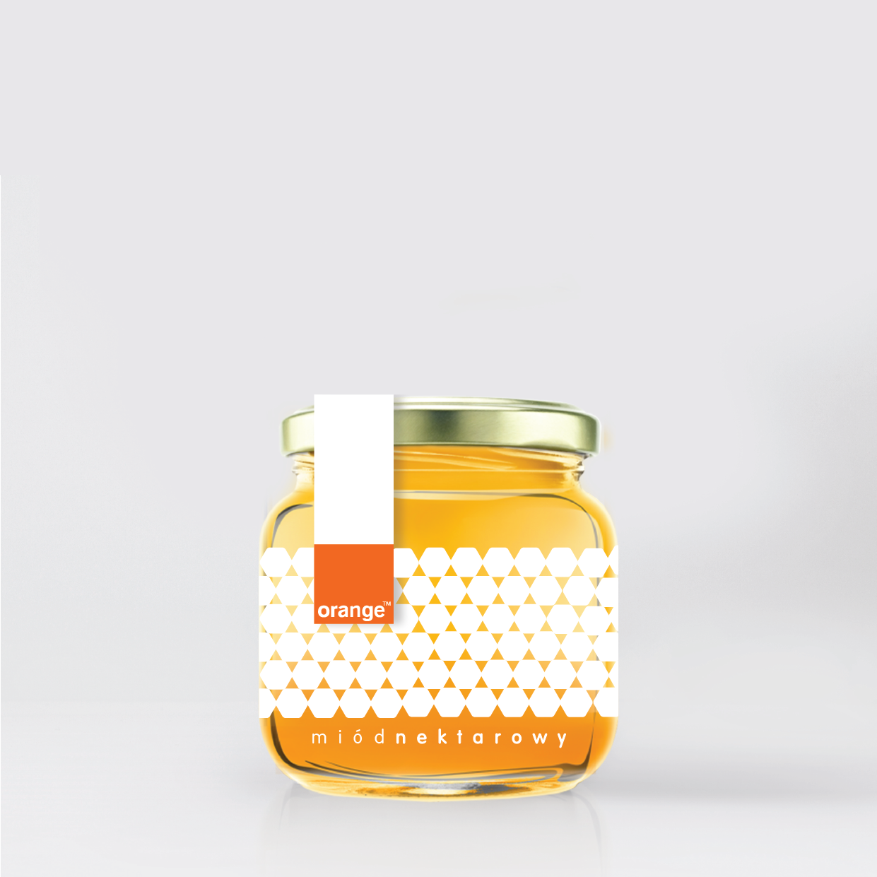
We have created a number of labels for Corpo, a distributor of honeys. Below, we present those developed for the purposes of a conceptual line of honeys dedicated to the Orange brand. See yourself what our studio came up with. Those were sweet days!
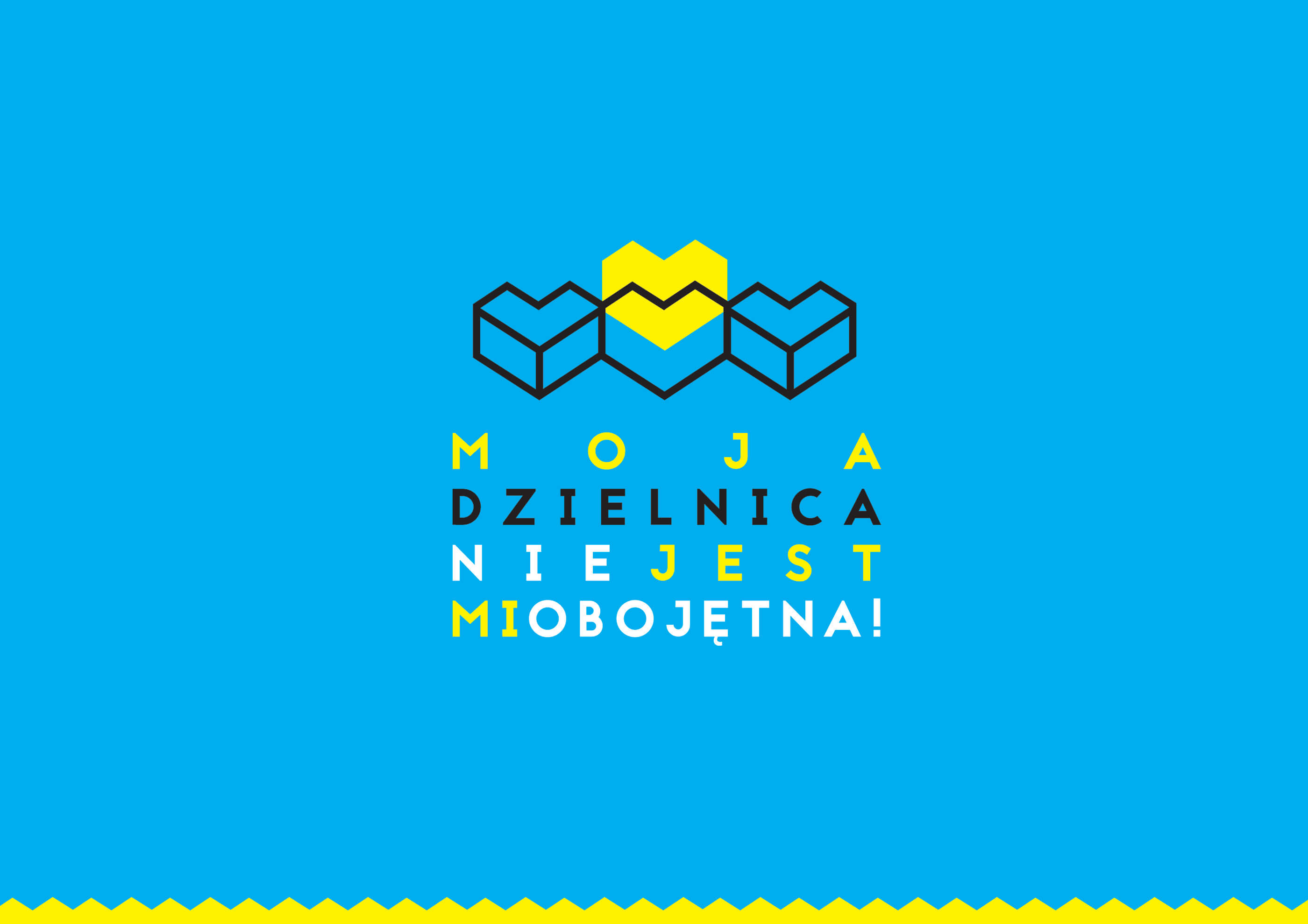
Pierwszy raz w 2017 zaprojektowaliśmy branding dla projektu społecznego realizowanego przez Stowarzyszenie Górnośląski Klaster Kreatywny pod hasłem „Moja dzielnica nie jest mi obojętna”. Katowice stawiają na zmianę u podstaw. Akcja miała skupić i zintegrować lokalne społeczności z 8 dzielnic Katowic. Prowadzone był warsztaty, konferencje i wiele innych spotkań. Znak nawiązuje do form budynków dzielnic mieszkalnych, […]
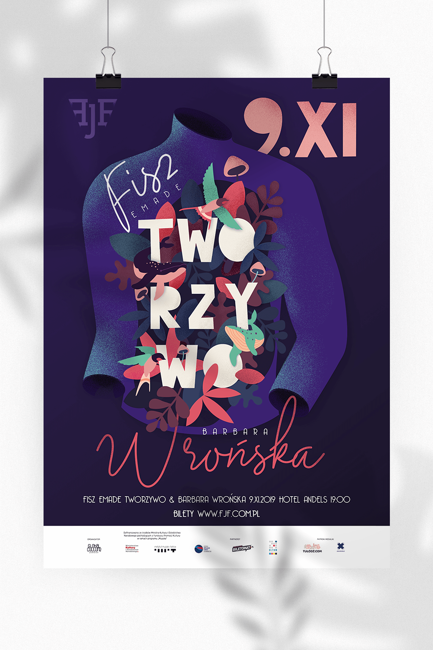
Freedom Jazz Festival is an annual music event which has been held in the city of Łódź since 2016. We developed its branding long time ago, and in 2019, once again, we performed creative work for the autumn concert by Fisz Emade Tworzywo and Barbara Wrońska.
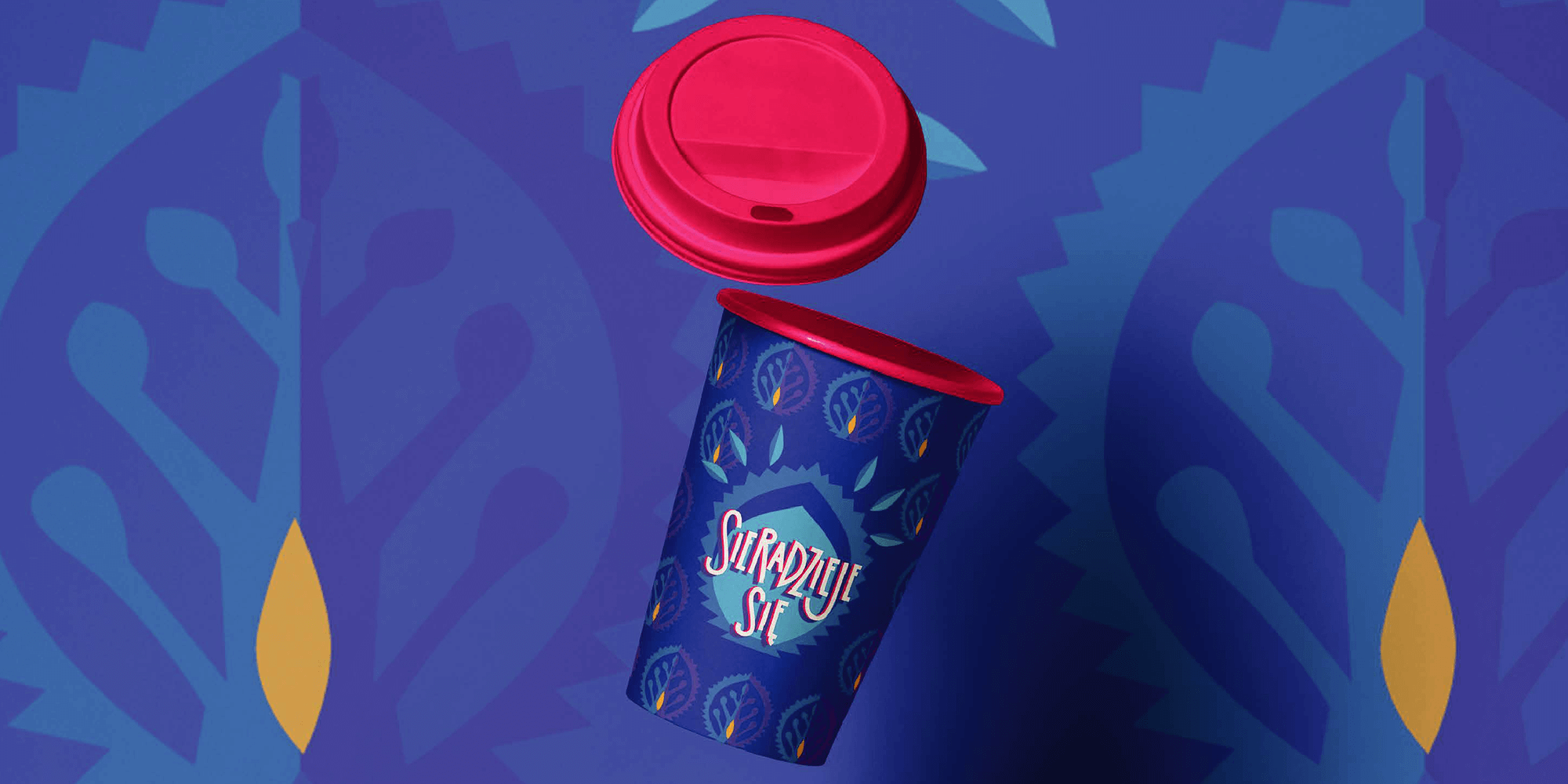
“Sieradzieje sie” [Things are happening in Sieradz] is an initiative of the town of Sieradz addressed to active people. Its main objective is to act for the town and its community. If you have an idea for Sieradz, you can tell the organisers about it. We had an idea for their branding and there you go! It was a joy for all inhabitants of Sieradz. It was supposed to be colourful, intensive and local. See the results below.

